Showing posts with label perspective. Show all posts

Tuesday, May 20, 2008

Perspectives: Is Brazil more significant than the whole of Africa?

This one took me a while to get over... it's one thing to look at SA compared to the rest of the world, but we also need to consider this continent that we are a part of and see where that fits into the global picture.

Firstly some quick background information. A list of 181 countries in terms of 2006 GDP [in US$ terms] is headed by the European Union at $14.5 trillion, followed by the USA at $13.2 trillion. Together these two make up almost 58% of the total world GDP of $48.1 trillion. The rest of the top 10 includes other countries such as Japan and Germany and ends with Brazil in 10th, which has a GDP of just over $1 trillion.

How does Africa fare compared to this lot?

Just look at the global perspective - here's a comparison between Brazil and Africa in three distinct ways: [Brazil on the left, Africa as a whole on the right]

Land area


Population


Wealth generated [GDP]


Incredible! Africa consists of 53 countries. Brazil is one country. Despite being only about a quarter the size of Africa in terms of land area and population, Brazil as a country generated as much wealth in 2006 as the whole of Africa did. And Brazil is also an 'emerging market economy', like South Africa is.

The big question, with this information in mind - what opportunities does this present to Africa [and South Africa]? Where Africa has historically relied on natural resources and labour to generate wealth, surely these statistics indicate that this isn't working.

How do you change the economic focus of an entire continent over a relatively short period? What do we need to do to change these circumstances? How can we create the possibility of exponential growth? These are all questions that need to be answered for Africa [and South Africa] to better position itself for the future.

Perhaps technology offers us a part of the solution? What do you think?

You can find my other posts in this theme here -> Perspectives

Sources:

Monday, April 21, 2008

Perspectives: South Africa - where do we actually fit in to a global economy?

This one simply blew my mind...

A little while ago, I had a look at the measure of SA's wealth - GDP [gross domestic product] and how SA has grown in wealth - you can see it here.

The funny thing about numbers is that they don't mean much unless you actually compare it to something else. South Africa generated $255,155 million in 2006. So what!?

As I was saying, this one simply blew my mind. Well, have a look for yourself:

Quick explanation:

  • the size of the bubble reflects population size
  • the further right the bubble is, the higher the country's total GDP [or wealth generated]; and
  • the higher up the bubble is, the higher the average GDP per person [the best indicator - shows average wealth generated per person]
  • SA is the green bubble in all the graphs
South Africa vs major African countries
[Egypt, Nigeria and Algeria]


You can see here that SA is way ahead of the pack compared to other African countries, both in terms of total GDP and GDP per person.

South Africa vs other emerging market countries
[India, China and Brazil]


Although SA is much smaller than all these other emerging markets, we're still ahead in terms of GDP per person.

South Africa vs some significant global economies
[USA, Japan, Germany, Great Britain, Australia]


Um, well.... what can I say. Blew my mind. Amazing that we can be so far ahead in the graphs above, and here we barely feature at all.

Certainly changed my perspective on where we live. Not in a bad way... there are lots of opportunities and positive aspects related to this. But I'll never think about it the same way again, that's for sure.

You can find my other posts in this theme here -> Perspectives

Source for information: International Monetary Fund

Tuesday, March 25, 2008

Perspectives: Earth lights

I couldn't resist putting this one here because, not only is this a stunning picture, but it's also a great way to see Earth's population from a different perspective:


[the small pic above doesn't do it justice - please click on the link to see the big one in more detail]

[Original source]

Sunday, March 16, 2008

Perspectives: South Africa - the growth phase

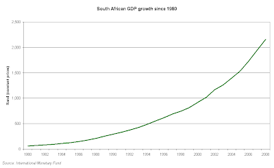
As a starting point, let's look at this amazing "growth phase" that we're going through and that everyone keeps referring to. "South Africa is growing", they say. But without a bit of background, it's difficult to see what this actually means to us. So let's try give it a go.

We'll start with GDP [aka Gross Domestic Product]. The SA Reserve Bank defines this as "the total value of all final goods and services produced within the boundaries of a country in a particular period". [If you're interested, they have a not-too-painful description of how its calculated on that page, worth a read if you have a slight interest in this topic]

I will use GDP as it is one of the most important measures of a country's economic health. I realise that money is not the only measure of a country's success, but it does provide a reasonable and easily understandable way of quantifying many of it's effects.

[Please bear with me. Sometimes the definitions and measures get a bit technical, but I'll try keep the info visual and understandable as far as possible.]

In real terms, this is how SA's GDP has grown since 1980:


It looks huge, but this doesn't take into account population growth, so GDP per person is often a good way to see if wealth per person has grown or not. Here is a look [the bars show the population growth, while the line shows GDP per person]:


Looks rosy so far, but we don't know if this only looks good because the Rand has gotten weaker or because of high inflation rates. To get an even better look, let's look at the GDP per person in US Dollar terms and also taking into account purchasing price parity [basically the price at which both currencies can buy the same goods over a longer-term period]:


From this, you can see SA has grown since 1980, and you can also see the accelerated growth phase we've been in since about 2002. Sadly not everyone has benefited from this, but that's another story for another day. For now at least, we can conclude that SA has definitely been growing, and continues to.

Does this mean anything to you? Anything I could improve? Have any thoughts as to what you would like to see or better understand? Please contact me or leave a comment below - I would value your feedback!

You can find my other posts in this theme here -> Perspectives

Source for information: International Monetary Fund

Friday, March 14, 2008

Perspectives: Turn your world upside down

Fitting in with the theme of perspectives, Elaine Rumboll was kind enough to show me this - a great, refreshing and different [particularly if you live in the Southern hemisphere] way to look at the world. [Thanks Elaine!]


This is an accurate rendition of a world map, but in this version, the cartographers have put Africa in the centre and have placed the South at the top and North at the bottom. The actual map and further details are available here at mindshift

A brilliant way to change our perspective!

As I've said here before - Let's turn the world upside down!

Follow my other posts in this theme here -> Perspectives

Wednesday, March 12, 2008

It's amazing what a change in perspective can do

It's time to start getting back on track with the theme of this blog, and I thought the best way to do that would be to provide a little bit of perspective on South Africa versus this world we're living in. Over the next few weeks I'll be putting up some [hopefully] interesting info which might just give you a slightly different view of this place we call home.

Just to give an idea of what I'm talking about, have a look at this amazing illustration from our stunning universe:

Our home - Earth, which holds over 6.5 billion people like you and me.


Look at how the sun dwarfs our "huge" planet Earth...


...and then look at how insignificant the sun is compared to the largest known star - Canis Majoris


[in the above picture, you cannot even represent the sun with a single pixel, it's so small]

It's amazing what a change in perspective can do!

[See my source here for a nice visual journey through the universe]